How to Construct Logo Lockups: Proportions, Spacing, and Responsive Systems

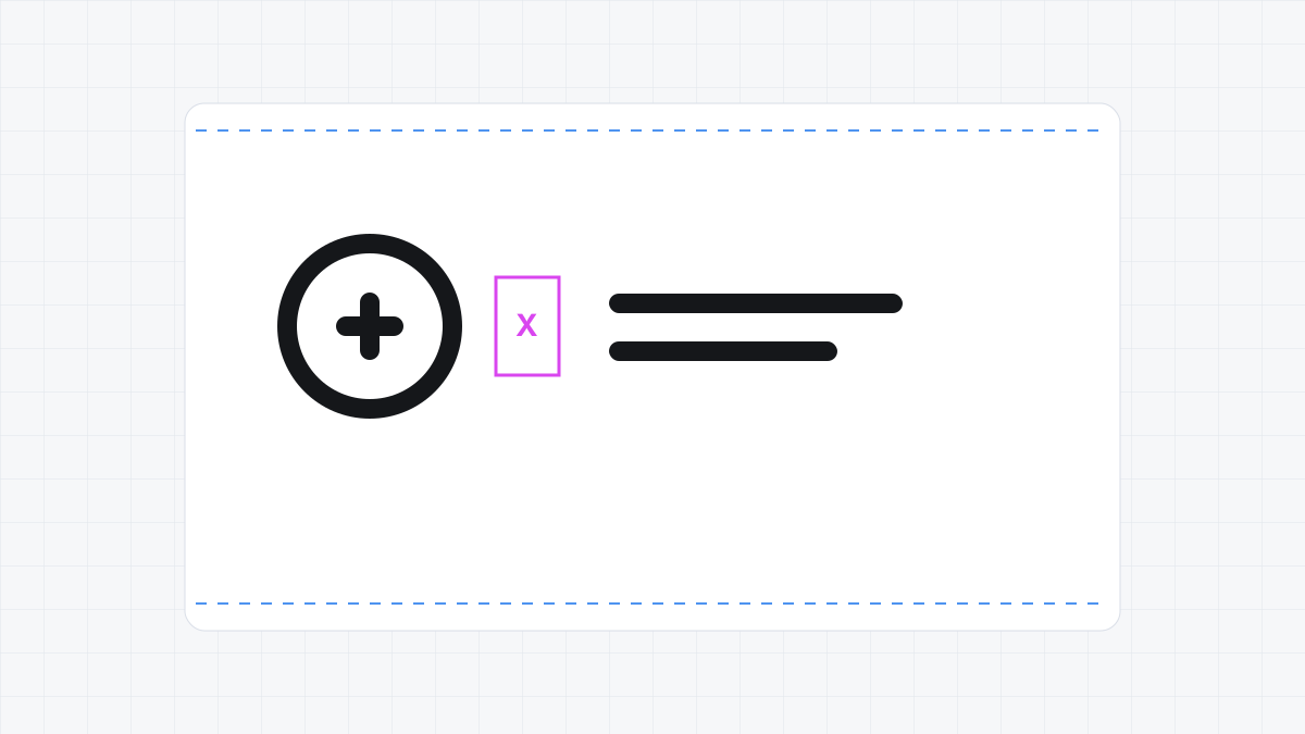
Quick Answer: A logo lockup is the fixed, proportional arrangement of a brand’s logomark (symbol) and logotype (wordmark). A horizontal lockup places the mark beside the text with a relative gutter of $1.0X$ to $1.5X$, while a vertical (stacked) lockup centers the mark above the text with a $1.5X$ to $2.0X$ gutter, where $X$ equals the wordmark’s x-height or cap-height. Hardcoding fixed pixels causes scaling errors; always define lockup geometry using relative ratios.
Workflow Note
The manual lockup method below defines the spacing rule clearly enough for a brand guide. When you need to repeat the same rule across horizontal, vertical, icon-only, and small-use versions, Logo Grider can generate spacer blocks, guide paths, and safety zones directly inside Illustrator.
1. Introduction
A brand identity system must perform across a vast array of media. A single logo layout cannot sit on a narrow pen, a wide website navigation header, a square social media profile icon, and a massive physical billboard. To solve these spatial constraints, identity designers create a system of logo lockups.
A logo lockup is the final vector asset containing the symbol, wordmark, and tagline assembled in a defined spatial arrangement. Historically, designers would manually position these elements on a page. Today, modern branding workflows dictate that these arrangements are finalized, saved as fixed assets, and delivered to clients as immutable vector files.
Creating these lockups requires more than simply putting a mark next to some text. It requires mathematical precision, geometric structure, and an understanding of optical balance. If you position elements arbitrarily, they will feel disconnected or optically misaligned when scaled. This guide explains how to construct mathematically balanced logo lockups in Adobe Illustrator, ensuring your brand assets scale flawlessly.
2. The Mathematics of Relative Spacing
To maintain structural integrity across different mediums, a logo lockup system must rely on relative mathematics. Hardcoding spacer distances in fixed units like 40px or 15mm fails because those values do not scale with the logo. A 40px gap looks correct on a screen but appears massive when printed on a tiny business card, or tiny on a giant sign.
To resolve this, define a relative spacer unit, designated as $X$, from a core design element.
Defining the Relative Unit $X$
Depending on the logo geometry, you can select one of three features to serve as your unit $X$:
- The X-Height of the Logotype: The height of the lowercase “x” in the brand’s name. This is the preferred choice for typographic-heavy brandmarks.
- The Cap-Height of the Logotype: The height of the capital letters. This is ideal if the logotype is written in all-caps.
- The Logomark Key Metric: The height or width of a prominent visual component in the symbol. For example, if your symbol contains a square, its width is the perfect unit $X$.
Once $X$ is defined, all gutters, margins, and spatial offsets are expressed as multiples of $X$.
Spacing Formulas for Standard Lockups
For a professional visual system, establish the following proportions:
- Horizontal Lockups: The symbol sits to the left of the wordmark. Define the gutter width ($G_h$) using: $$G_h = X \times 1.0$$ For wider, more breathable layouts, use: $$G_h = X \times 1.5$$
- Vertical/Stacked Lockups: The symbol sits centered above the wordmark. Define the vertical gutter ($G_v$) using: $$G_v = X \times 1.5$$ For highly decorative marks, use: $$G_v = X \times 2.0$$
- Tagline Integration: The tagline sits below the wordmark. The distance between the wordmark baseline and the tagline cap-height ($G_t$) is calculated as: $$G_t = X \times 0.75$$
By grounding your spacing in these formulas, the visual relationship between your mark and type remains consistent whether the asset is scaled down to a favicon or blown up to cover a building.
3. Optical Balance vs. Geometric Centering
A major mistake in lockup construction is trusting Illustrator’s alignment tools blindly. Vector software calculates alignment based on the bounding box of a path, which is a rectangle encompassing the extreme outermost coordinates of that shape. However, human eyes do not perceive visual weight in rectangular bounds. We perceive it through visual mass.
The Visual Weight of Shapes
Consider a circle, a triangle, and a square aligned to their geometric centers. The triangle will appear shifted because its visual mass is concentrated at its base, leaving the top apex looking light. Similarly, a logomark with a heavy left side will appear off-center if aligned using the Align Panel’s center option.
- Circles: A circle has less visual weight at its edges than a square. To balance a circle next to vertical text, the spacing must be measured from the optical edge rather than the geometric bounding box.
- Triangles / Asymmetric Marks: The center of visual gravity (the centroid) is where the mass balances. For a triangle, this is located at: $$C_y = \frac{h}{3}$$ where $h$ is the height of the triangle. If you align using the bounding box ($h/2$), the triangle will look physically too low.
Always inspect your lockups zoom-out. Turn off your selection outlines (Ctrl + H (Windows) / Cmd + H (macOS)) and adjust the alignment manually by a few pixels until the mark feels visually centered.
4. Step-by-Step Lockup Construction in Adobe Illustrator
Follow this tutorial to build a primary horizontal lockup and a secondary vertical lockup.
Step 1: Prep and Outline Your Vector Shapes
Before building a lockup, you must clean up your assets to ensure bounding boxes are tight and fonts do not shift.
- Open your document containing your logo symbol and type.
- Select your typography. Convert it to outlines by pressing Ctrl + Shift + O (Windows) or Cmd + Shift + O (macOS).
- Select your outlined text, go to Object > Path > Clean Up…, and check all boxes to remove stray points or empty paths.
- If your symbol consists of overlapping shapes, open the Pathfinder Panel (Window > Pathfinder) and click Unite to merge them into a single clean shape.
Step 2: Establish and Measure Your Unit $X$
In this example, we will use the cap-height of our logotype as unit $X$.
- Select the Zoom Tool (Z) and focus on the first uppercase letter of your logotype.
- Press M to activate the Rectangle Tool.
- Click and drag a rectangle spanning the exact height of the capital letter.
- Open the Transform Panel (Window > Transform). Note the height ($H$) value. If the height is $30\text{px}$, then $X = 30\text{px}$.
- Fill this rectangle with a bright, non-printing color (like 100% Magenta) and label it as your X-Spacer in your layers.
Step 3: Construct the Horizontal Lockup
The horizontal lockup is the primary configuration for most brands because it fits neatly in web headers and documents.
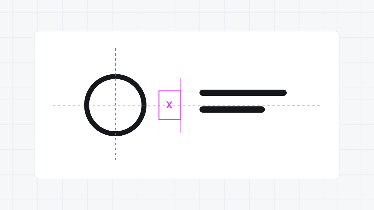
- Place your logomark to the left of your logotype.
- Take your X-Spacer rectangle. Rotate it so it is horizontal.
- Align the left edge of the X-Spacer to the far right edge of your logomark bounding box.
- Move your logotype so its far left anchor points snap to the right edge of the X-Spacer.
- To align the elements vertically, select both the logomark and logotype. Open the Align Panel (Window > Align). Click Vertical Align Center.
- Apply Optical Adjustment: Look at the relationship. If your logomark is asymmetrical, use your keyboard arrow keys to nudge the mark up or down until it balances visually with the logotype.
- Group the final composition by selecting both and pressing Ctrl + G (Windows) or Cmd + G (macOS).
Step 4: Construct the Stacked (Vertical) Lockup
Vertical lockups are useful for banners, packaging, and social media avatars.
- Duplicate your symbol and logotype assets.
- Position the logomark centered above the logotype.
- Take your X-Spacer and scale it vertically to $1.5 \times X$ (in our case, $1.5 \times 30\text{px} = 45\text{px}$).
- Align the top of the scaled spacer to the bottom edge of the logomark.
- Align the top of your logotype to the bottom edge of the spacer.
- Select both the logomark and logotype. In the Align Panel, click Horizontal Align Center.
- Nudge the elements as needed to balance the optical center of gravity.
- Group the vertical lockup (Ctrl + G / Cmd + G).
Step 5: Construct the Exclusion (Clearspace) Zone
To ensure no other visual elements crowd the logo, you must define the exclusion boundary.
- Select your horizontal lockup group.
- Press Ctrl + C and then Ctrl + F (Windows) or Cmd + C and Cmd + F (macOS) to copy and paste the group in front.
- With the copy selected, go to the Pathfinder Panel and click Unite to turn the entire lockup copy into a single solid silhouette path.
- Go to Object > Path > Offset Path….
- Set the Offset value to your unit $X$ (e.g.,
30px) or $1.5 \times X$ (e.g.,45px), set Joins to Miter, and click OK. - Delete the inner silhouette path, leaving only the expanded outer path.
- Change the stroke of this outer path to a bright cyan line, set its fill to none, and convert it to a guide by pressing Ctrl + 5 (Windows) or Cmd + 5 (macOS).
5. Real-World Handoff & Export Specs
Creating lockups is only half the battle; you must hand them off to clients and developers in a structured format.
File Format Requirements
For every lockup configuration, export the following formats:
- SVG (Scalable Vector Graphics): The standard for web use. Ensure you check “Convert to Outlines” for fonts and “Minify” in the SVG export options to keep file sizes under $5\text{KB}$.
- EPS (Encapsulated PostScript): The legacy standard for professional printing. Save in EPS Illustrator CS6 compatibility mode to ensure print shop software can read the file.
- PNG (Portable Network Graphics): High-resolution raster files with transparent backgrounds. Export at $300\text{PPI}$ (for print layouts) and a digital resolution of $2000\text{px}$ on the longest edge.
Standardized Naming Convention
Organize your assets using a logical, hyphenated naming system. Avoid spaces or capital letters to prevent web server errors. Use the following naming structure:
[brandname]-[lockup]-[hierarchy]-[color-mode].[extension]
For example:
studio-horizontal-primary-positive.svg(Horizontal, primary logo, brand colors for light backgrounds)studio-vertical-secondary-reverse.svg(Vertical/stacked, secondary logo, white for dark backgrounds)studio-symbol-icon-monochrome.eps(Symbol-only, solid black for single-color print runs)
6. Common Logo Lockup Mistakes
Avoid these four common pitfalls during lockup design:
1. Relying Strictly on Geometric Centering
As discussed, geometric centroids often do not align with visual weight. If your mark has an extended tail or flourish, align using the optical bulk of the shape, or the type will look disconnected.
2. Hardcoding Spacing Dimensions
Never write 50px spacing in a brand guide. If the developer scales the logo down to 100px total width, a 50px gap will consume half the screen. Always express margins in relative units (e.g., “Clear space is equal to $1.5 \times$ the cap-height of the logotype”).
3. Overcomplicating the System
Do not create dozens of lockup configurations. A healthy brand identity system needs only four variations:
- Horizontal (Primary)
- Stacked / Vertical (Secondary)
- Typographic Wordmark (No symbol)
- Visual Symbol (No text) Adding more variations dilutes the brand recognition and confuses the client’s team.
4. Neglecting Minimum Size Scaling
A logo lockup with thin lines or a small tagline will turn into a blurry blob when scaled down to mobile screen sizes. Test your lockup legibility: scale the horizontal lockup to $120\text{px}$ width. If the tagline is unreadable, create a secondary “small-use” lockup that removes the tagline entirely and increases typographic stroke weights.
7. Workflow Tools Recommendation
To build precise, agency-grade systems efficiently, consider these tools:
- Logo Grider: Our custom Adobe Illustrator extension panel is designed specifically for logo construction. It allows you to build custom layout grids, snap anchor coordinates, establish proportional gutters, and output clearspace lines in a single click, completely eliminating manual scaling calculations.
- Ultimate Brand Guidelines Template: This professional 36-page brand book template is available for Illustrator, InDesign, and Figma. It features pre-constructed layout spreads for presenting primary and secondary logo lockups, explaining clear space math, and detailing brand application examples to your clients.
8. FAQ
What is the difference between a logo and a logo lockup?
A logo is a broad term describing any mark representing a brand. A logo lockup is a specific, engineered arrangement of individual logo elements (symbol, text, tagline) locked in fixed spatial coordinates.
How many lockup variations does a brand need?
Most brands require three to four variations: a horizontal primary lockup (best for navigation bars), a vertical secondary lockup (best for centered print assets), and standalone wordmarks or symbols for tiny screens or icons.
When should I use a vertical vs. a horizontal lockup?
Use the horizontal lockup when vertical space is restricted, such as website navigation menus, stationery headers, or desktop email signatures. Use the vertical lockup when horizontal space is constrained, such as square social profiles, product packaging, bags, or signs.
Should the tagline always be included in a lockup?
No. The tagline is optional and should be removed in small-scale applications. A primary lockup includes the tagline for high-profile assets (like posters or package fronts), while a secondary lockup removes the tagline to maximize type readability at small sizes.
What is the standard margin for a logo exclusion zone?
The industry standard exclusion zone is equal to $1.0 \times X$ or $1.5 \times X$, where $X$ is a relative measurement unit derived from the logotype x-height, cap-height, or the thickness of the logomark.
9. Next Steps: Client Guidelines & Presentation
Constructing a professional logo lockup system requires moving beyond visual guesswork. By defining a mathematical unit of spacing $X$ and aligning elements according to optical balance rather than bounding boxes, you create a robust visual system that remains consistent on any device.
Once you have finalized your logo lockups, the next step is to present them clearly in a brand guide. Use our Ultimate Brand Guidelines Template to display your new horizontal, vertical, and icon variations in a clean layout that will impress your clients and developers alike.
Table of Contents
Recommended Tools
Logo Grider
Build logo grids, clear space rules, lockups, and minimum size systems in seconds. Logo Grider is a powerful Illustrator panel for logo designers.
GridMaster
Create precise, professional vector layouts in seconds. GridMaster generates column, modular, baseline, and composition grids in Illustrator.
ColorLens
Generate palettes, check WCAG contrast, extract image colors, and export specification sheets directly inside Adobe Illustrator with ColorLens.
Identity Assets
Bold Brand Guidelines Template
A high-performance landscape layout template for InDesign, Figma, and Illustrator. Deliver agency-level brand style guides to your clients.
Free Brand Guidelines Template
A clean brand guidelines template fully editable in Adobe Illustrator and InDesign. Ideal for freelancers and agencies organizing brand rules.
Ultimate Brand Guidelines Template
The ultimate 36-page professional brand guidelines template for Adobe Illustrator, InDesign, and Figma. Deliver agency-level brand books to clients.
Glossary Terms
Get New Branding Resources Every Week
Join over 10,000 identity designers who receive our latest curated tutorials, grid templates, checklists, and Illustrator workflow optimizations straight to their inbox.
Zero spam. Unsubscribe with a single click at any time.
Continue Reading
How to Calculate Logo Clear Space: Spacing Ratios, Safety Zones & Exclusion Rules
Master logo clear space math. Technical guide covering x-height formulas, exclusion zones, safe areas, vector margins, and automated Illustrator tools.
Golden Ratio vs. Rule of Thirds in Illustrator: Setup Math & Composition Grids
Master the Golden Ratio (1:1.618) and Rule of Thirds (3×3) in Adobe Illustrator. Exact vector math, step-by-step setup, and composition decision frameworks.
How to Make a 12-Column Grid in Adobe Illustrator (Manual Method & 1-Click Guides)
Learn how to set up a mathematically balanced 12-column layout grid in Adobe Illustrator. Step-by-step tutorial covering columns, gutters, margins, and guides.