How to Calculate Logo Clear Space: Spacing Ratios and Visual Safety Zones

Quick Answer: Logo clear space (also known as safety zone or padding) is an invisible margin around a logo that must remain free of other graphic elements, typography, or page borders. Rather than using fixed pixel values, calculate clear space using a relative unit $X$ (derived from a key feature in the logo, such as the x-height of the typography or the width of the icon mark). The standard corporate safety margin is set at $1.5 \times X$ or $1.0 \times X$ offsets. In Adobe Illustrator, you measure this relative unit, create bounding rectangles, and use the Object > Path > Offset Path command to render the boundary guides.
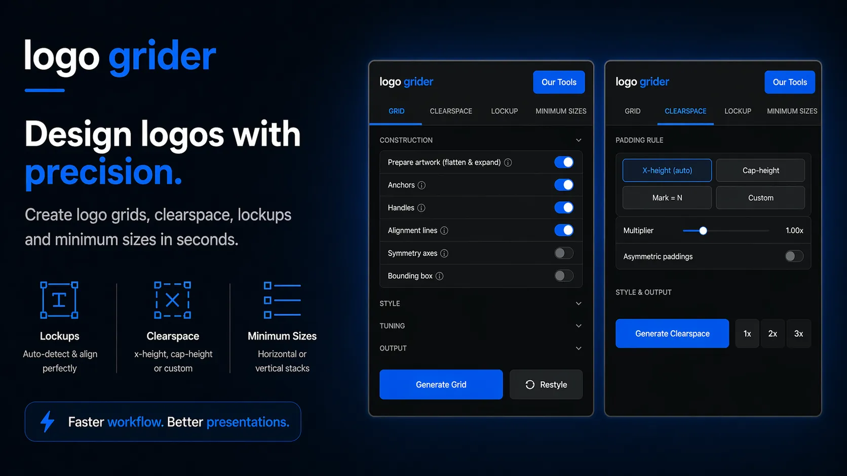
[!TIP] Workflow Tip: Instead of manually creating spacer blocks and calculating offsets for clearspace guidelines, you can automate this using the Logo Grider extension panel for Adobe Illustrator. It generates proportional safety margin vectors using relative parameters (x-height or cap-height) in a single click.
1. Introduction
A logo never exists in a vacuum. It is constantly surrounded by headlines, photos, interface components, and print margins. Without strict spacing rules, layouts easily become cluttered, reducing the legibility of the mark and diluting the brand’s identity. To prevent other design elements from encroaching on the logo, identity designers establish a safety perimeter called logo clear space.
Defining this boundary is a critical phase of any brand identity system. However, a common mistake is specifying clear space in hardcoded, fixed units (like 50px or 20mm). These fixed values break down when the logo scales; a 50px margin is far too large for a small mobile favicon and too small for a large outdoor banner. To build a robust visual identity, you must calculate and specify clear space using a relative mathematical system. This guide breaks down the formulas, steps, and tools to construct clean, relative safety zones.
2. The Mathematics of Relative Clear Space
To maintain visual proportions at any size, clear space must scale dynamically with the logo. This is achieved by selecting a specific portion of the logo design to serve as the relative unit of measurement, labeled as $X$.
Common choices for unit $X$ include:
- The X-Height of the Logotype: The height of the lowercase “x” in the brand’s name. This is ideal for wordmarks.
- The Cap-Height of the Logotype: The height of the uppercase letters.
- The Icon Boundary Width: The width or height of a distinct element within the logo mark (e.g. the icon’s central square).
Once you select unit $X$, define the safety margin as a multiplier of that unit. The standard formula for professional branding systems is:
$$S_c = X \times 1.5$$
For tighter layouts, you can define a secondary, compact spacing rule using:
$$S_c = X \times 1.0$$
By declaring your spacing rules using these formulas, the safety zone remains perfectly proportional whether the logo is printed on a business card or rendered in a website footer.
3. Step-by-Step Clear Space Construction in Illustrator
Follow these steps to measure unit $X$, construct the boundary boxes, and establish non-printing guides inside Adobe Illustrator.
Step 1: Select and Measure Your Spacing Unit
First, identify the element in your logo that will establish the relative unit $X$.
- Open your finalized logo vector file. Ensure all text paths have been outlined by pressing Ctrl + Shift + O (Windows) or Cmd + Shift + O (macOS) to prevent font substitution issues.
- Zoom in on the logotype by pressing Z and dragging over the text.
- Select the Rectangle Tool by pressing M.
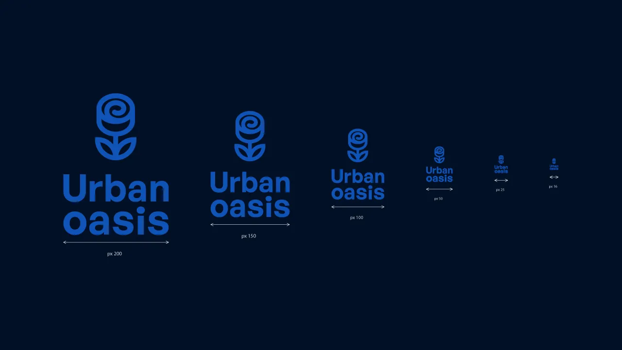
- Draw a rectangle that spans the exact vertical height of your lowercase “x” or uppercase letters. Check the Transform Panel (Window > Transform) to note the height. Let’s say this height is $24\text{pt}$—this is your unit $X$.
Step 2: Construct Bounding Reference Squares
Now, build the safety blocks that will sit on the outer edges of the logo.
- Duplicate the reference rectangle you drew. Move it to the side.
- Select this rectangle and hold down Shift while resizing it to make it a perfect square ($24\text{pt} \times 24\text{pt}$). Let’s label this square block as Spacer X.
- If your spacing rule is $1.5X$, select the square, go to Object > Transform > Scale, and scale it uniformly to
150%. The size will update to $36\text{pt}$—this represents Spacer 1.5X. - Change the fill color of this spacer to a high-contrast hue (like bright magenta) so it is easily distinguishable from your artwork.
Step 3: Align Spacers to Logo Boundaries
Next, align your spacers to the absolute outermost edges of the logo mark.
- Turn on Smart Guides by pressing Ctrl + U (Windows) or Cmd + U (macOS) to ensure paths align perfectly.
- Place copies of your Spacer 1.5X block on all four sides of the logo:
- Align one block to the far left edge of the logo mark.
- Align one block to the far right edge of the logotype.
- Place one block on the highest top anchor point.
- Place one block on the lowest bottom anchor point.
- Use the Align Panel (Window > Align) to ensure the spacers snap cleanly against the vector bounds without overlapping them.
Step 4: Draw and Export the Clear Space Boundary
With the spacers in place, draw the boundary path.
- Select the Rectangle Tool (M).
- Draw a rectangle that encapsulates the logo and all four of your aligned spacer blocks. The rectangle should snap directly to the outer edges of the spacers.
- Delete the temporary magenta spacer blocks. You are left with a single boundary rectangle surrounding your logo.
- Select this boundary rectangle and change its stroke to a clean, non-printing cyan line with a stroke weight of
1pt. Set its fill to none. - Convert this rectangle to a guide: Select it and press Ctrl + 5 (Windows) or Cmd + 5 (macOS) (or select View > Guides > Make Guides).
4. Real-World Application and Brand Guidelines Handoff
When hander over brand assets to a client, they need to know exactly how to apply the spacing rules. Simply writing “maintain clear space” is insufficient. Your deliverables package must include a visual diagram showing the clear space rules.
This diagram is typically presented in the “Logo Usage” section of your corporate brand book. On this page, you display the logo with the spacer blocks overlaid on the corners (typically represented by a transparent blue box containing the letter “X” to denote the relative unit).
For example, when preparing assets for print production (such as packaging box layouts or corporate stationery), prepress operators use this clear space boundary to determine the minimum distance between the logo and die-cut lines. If the logo is placed too close to a crop line, it risks getting trimmed during production. By enforcing the $1.5X$ rule, you ensure the mark remains safe.
5. Common Clear Space Design Mistakes
Avoid these frequent mistakes when setting up your safety zones:
- Specifying Fixed Pixel Ratios: Declaring “the clear space must always be 50 pixels.” When the logo is scaled down to a favicon size of $16\text{px} \times 16\text{px}$, a $50\text{px}$ margin is impossible.
- Using a Complicated Unit X: Selecting a highly complex portion of the logo icon (like a diagonal curved line) as your unit $X$. This makes it extremely difficult for external designers and developers to measure and calculate margins manually. Always choose a clean vertical or horizontal segment.
- Inconsistent Vertical and Horizontal Offsets: Using a vertical height for horizontal clear space, and a horizontal width for vertical clear space. Keep your spacers consistent on all sides using a square unit block.
- Forgetting Color Contrast Boundaries: Placing clear space boundaries only around the logo shape itself, while ignoring background containers. The clear space rule must also apply to background color cards and container boundaries.
6. Tools & Workflow Recommendations
Manually constructing bounding rectangles, multiplying coordinates, and placing spacer blocks for every client project is tedious and invites alignment errors.
To automate this workflow, you can use the Logo Grider extension panel for Adobe Illustrator. The panel includes a dedicated Clearspace Creator utility. Simply select your logo mark, define which vertical or horizontal boundary represents unit $X$, and click the spacing multiplier button. Logo Grider instantly calculates the relative boundaries, places spacer blocks, and generates the cyan safety guides directly on your artboard in seconds.
To document these calculations in a polished, client-facing PDF, import your spacer layouts into our Ultimate Brand Guidelines Template. It includes pre-styled pages and vector grids specifically designed to showcase your relative $X$ spacing math.
7. FAQ
What does “X” represent in logo clear space?
“X” represents a relative unit of measurement taken from a specific part of the logo, such as the height of a letter or the width of the icon mark. Using “X” allows the safety zone to scale proportionally with the logo size.
Is clear space the same as padding?
Yes. Clear space is conceptually identical to CSS padding. However, while padding is often set in static units in web design, logo clear space must remain relative to the logo’s active size.
What is the standard clear space multiplier?
The industry standard multiplier for logo safety zones is $1.5 \times X$. For compact layouts, a multiplier of $1.0 \times X$ is acceptable.
Can text or backgrounds enter the clear space?
Background colors and background photography can sit behind the logo and fill the clear space. However, text, other logos, borders, and main design elements must never cross the clear space boundary.
How do I lock guides in Illustrator so they do not move?
Select View > Guides > Lock Guides from the menu, or press Ctrl + Alt + ; (Windows) or Cmd + Option + ; (macOS) to toggle guide locking.
8. Conclusion
Calculating relative logo clear space is an essential step in maintaining brand integrity across print and digital media. By selecting a clean unit $X$ (like the typographic x-height) and enforcing a consistent $1.5X$ safety margin, you prevent layout clutter and keep the brand looking premium.
To streamline your design handoff, check out our Ultimate Brand Guidelines Template to present your spacing rules, colors, and typography in a clean, professional PDF, and read our tutorial on How to Construct Geometric Logo Grids.
Table of Contents
Recommended Tools
Logo Grider
Build logo grids, clearspace rules, lockups, and minimum size systems in seconds. Logo Grider is a clean, easy-to-use Illustrator panel designed for professional brand designers.
ColorLens
Stop jumping between websites and manual workflows. ColorLens brings palette generation, WCAG contrast checks, image color extraction, and color specification sheet export directly into Adobe Illustrator.
GridMaster
Create precise, professional layouts in seconds. GridMaster is a powerful Adobe Illustrator panel designed to generate column, modular, baseline, and composition grids.
Identity Assets
Bold Brand Guidelines Template
A high-performance landscape layout template built for InDesign, Figma, and Illustrator. Reclaim your design time and deliver agency-level style guides to clients.
Free Brand Guidelines Template
A professional and clean brand guidelines template fully editable in Adobe Illustrator and InDesign. Perfect for freelancers, agencies, and business owners looking to organize brand rules.
Ultimate Brand Guidelines Template
The ultimate 36-page professional brand guidelines template built for Adobe Illustrator, InDesign, and Figma. Streamline your workflow and deliver agency-level brand books.
Glossary Terms
Get New Branding Resources Every Week
Join over 10,000 identity designers who receive our latest curated tutorials, grid templates, checklists, and Illustrator workflow optimizations straight to their inbox.
Zero spam. Unsubscribe with a single click at any time.
Continue Reading
The Logo Grid Blueprint: How to Construct Geometric Logos in Adobe Illustrator
A comprehensive, step-by-step guide to constructing geometric logo grids using concentric circles, polar coordinates, and snapping systems inside Adobe Illustrator.