
How to Verify WCAG Color Contrast in Adobe Illustrator

Quick Answer: To verify WCAG 2.1 / 2.2 color contrast ratios in Adobe Illustrator, measure relative luminance between foreground text and background shapes. WCAG standards require 4.5:1 contrast for standard text (AA level) and 7:1 for enhanced contrast (AAA level). Large text (18pt+ or 14pt bold) requires 3:1 (AA) and 4.5:1 (AAA). Because Illustrator lacks a built-in contrast tool, use the ColorLens extension panel to test vector contrast ratios live on your artboard in real-time.
Workflow Note
Manual contrast checking works for isolated color swatches, but checking full brand color systems manually becomes tedious. ColorLens runs live WCAG contrast math directly on selected vector shapes in Illustrator, allowing you to test swatches and tweak colors in real-time without leaving your artboard.
1. Why Color Accessibility Matters in Modern Brand Identity
Brand identity is no longer static or print-only. Key brand touchpoints live on screens—websites, mobile apps, digital decks, social media templates, and email campaigns. Building a color palette readable by everyone, including users with visual impairments, low vision, or color blindness, is a mandatory requirement for modern branding studios.
Global legislation (such as the Americans with Disabilities Act (ADA) in the United States and the European Accessibility Act (EAA) in Europe) enforces digital accessibility standards. Failing to check color contrast during the initial brand guidelines development phase causes web developers to reject brand palettes later, forcing a painful, costly re-branding process.
Checking contrast early inside Adobe Illustrator ensures that every brand color combination is legible, legally compliant, and production-ready before client handoff.
Color contrast accessibility directly impacts user engagement and conversion rates across all digital marketing materials:
- Enhanced Readability: High-contrast text reduces cognitive fatigue and increases reading speed on mobile devices.
- Improved Outdoor Performance: High-contrast digital assets remain legible when viewed on mobile screens under direct sunlight.
- Brand Reputation: Demonstrating commitment to inclusive accessibility standards enhances agency credibility when bidding for corporate and government branding contracts.
- Reduced Bounce Rates: Visitors leave web pages quickly if low-contrast body copy causes eye strain. Establishing high contrast keeps users engaged longer.
2. The Mathematics of WCAG Color Contrast: Luminance & Formulas
To build accessible brand systems, it helps to understand the math used to calculate contrast ratios. Contrast is not determined by perceived differences in color hue, but by relative luminance (light intensity).
Relative luminance $Y$ is defined on a normalized scale from $0.0$ (pure black #000000) to $1.0$ (pure white #FFFFFF).
2.1 sRGB Linearization Formula
Before calculating luminance, raw sRGB values ($R, G, B$ ranging from $0$ to $255$) are normalized to a $0.0$–$1.0$ scale ($C_{srgb} = V / 255$) and linearized to remove gamma correction:
If $C_{srgb} \le 0.04045$: $$C = \frac{C_{srgb}}{12.92}$$
Otherwise: $$C = \left(\frac{C_{srgb} + 0.055}{1.055}\right)^{2.4}$$
(Where $C$ represents the linearized RGB channel value.)
2.2 Relative Luminance Calculation
Once channels are linearized, relative luminance $Y$ is calculated using standardized spectral weighting factors:
$$Y = 0.2126 \times R + 0.7152 \times G + 0.0722 \times B$$
Green accounts for $71.5%$ of human optical luminance perception, while blue accounts for only $7.2%$.
2.3 Contrast Ratio Multiplier
Once luminance values for the lighter color ($L_1$) and darker color ($L_2$) are known, the WCAG contrast ratio is calculated using:
$$\text{Ratio} = \frac{L_1 + 0.05}{L_2 + 0.05}$$
The $+0.05$ constant accounts for ambient light reflections on digital displays. Resulting ratios fall between $1.0:1$ (identical colors, zero contrast) and $21.0:1$ (pure black on pure white, maximum contrast).
3. Understanding WCAG Compliance Requirements
The Web Content Accessibility Guidelines (WCAG) specify three compliance levels: A, AA, and AAA. Level AA is the required standard for commercial branding and web design.
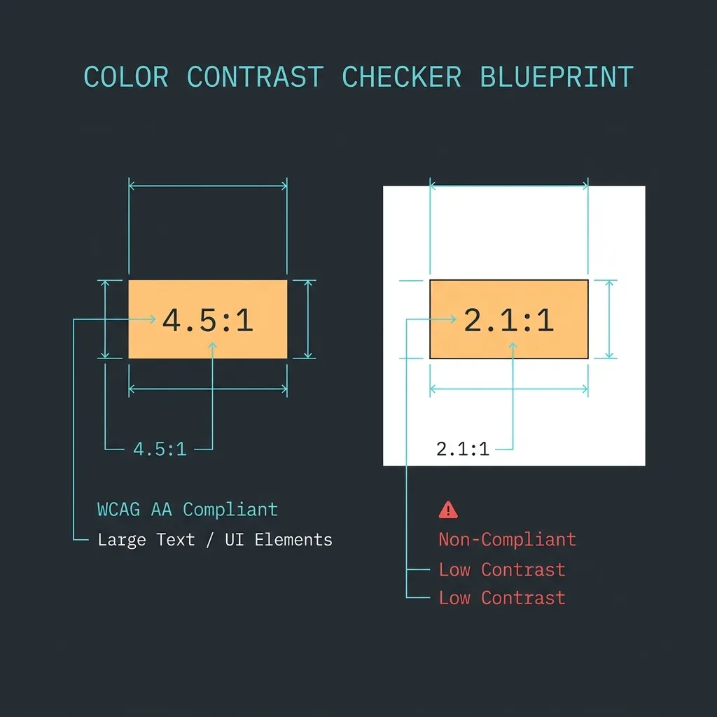
| Element Type | AA Requirement | AAA Requirement |
|---|---|---|
| Normal Text (Under 18pt regular / 14pt bold) | 4.5:1 | 7:1 |
| Large Text (18pt+ regular / 14pt+ bold) | 3:1 | 4.5:1 |
| Graphical Objects & UI Controls | 3:1 | 3:1 |
What Qualifies as Large Text?
Under WCAG 2.1 guidelines, typography qualifies as “large text” if it is:
- 18 points ($24\text{px}$) or larger in a regular font weight.
- 14 points ($18.6\text{px}$) or larger in a bold font weight.
For headings and UI callouts, achieving the $3:1$ threshold is acceptable under AA rules, but striving for $4.5:1$ ensures superior legibility on low-resolution displays.
4. How to Check Color Contrast in Adobe Illustrator (Manual Method)
Because Illustrator lacks a native contrast tool, designers traditionally use a manual browser workaround:
Step 1: Extract Hexadecimal Color Codes
- Select your foreground text vector shape in Illustrator. Double-click the Fill Color box in the toolbar.
- Copy the 6-character Hex code (e.g.
#FF5B22) from the bottom input field. - Select the background rectangle shape and copy its Hex code (e.g.
#F4F4F0).
Step 2: Test via Online Contrast Tools
- Open a web browser and navigate to a WCAG testing tool (such as WebAIM Contrast Checker).
- Paste the foreground and background hex values into their respective input fields.
- Review the calculated contrast ratio and check the Pass/Fail markers for AA and AAA levels.
Step 3: Manual Color Tweaking
If the combination fails (e.g., yielding 3.1:1 for normal text):
- Return to Illustrator, select the text or background, and adjust the brightness/saturation in the Color Picker.
- Copy the new hex code, switch back to your browser, paste, and re-test.
- Repeat this back-and-forth loop until you hit the required
4.5:1threshold.
For a full brand identity palette containing 5 core brand swatches and 10 secondary accent colors, testing all potential color pairs manually takes hours of repetitive copying, pasting, and browser switching.
5. Professional Solution: Live Contrast Inspection with ColorLens
To eliminate copying hex codes to external browsers, the ColorLens panel runs live WCAG contrast analysis natively inside Adobe Illustrator:
Step 1: Open and Dock the Panel
- Go to Window > Extensions > ColorLens to launch the panel.
- Dock ColorLens in your Illustrator workspace sidebar.
Step 2: Real-Time Vector Contrast Testing
- Select your text shape and background shape on your active artboard.
- ColorLens calculates relative luminance instantly and displays the exact contrast ratio (e.g.
5.8:1) with green AA / AAA pass badges. - Drag live brightness sliders inside the panel to adjust color values directly on your vector artboard until target contrast is achieved.
Step 3: Automated Palette Export
Once you establish passing ratios for your brand swatches, ColorLens can export contrast metadata tags directly onto your artboard as text labels. This allows you to generate ready-to-publish color specification cards for your brand guidelines document in a single click.
6. Creating an Accessible Brand Color Palette Matrix

When handing off style guides to clients or web teams, document allowed color pairings clearly in your brand book:
- Arrange Primary Swatches: Position core brand colors as squares in a grid.
- Map Permitted Combinations: Below each swatch, list approved foreground text colors.
- Document Contrast Ratios: Record numerical ratios alongside compliance markers:
- Deep Navy on Cream: 8.4:1 (AA & AAA Compliant)
- Brand Orange on Cream: 3.1:1 (Large Text Only — AA Compliant)
- White on Brand Orange: 2.8:1 (Fails — Do Not Use)
Building a formal matrix prevents junior designers and external vendors from making unauthorized color pairings that compromise readability.
7. Common Accessibility Mistakes in Branding
Avoid these frequent color mistakes during visual identity design:
- White Text on Vibrant Orange / Yellow: Brand identities often use vibrant orange (
#FF5B22) or yellow accents. White text on vibrant orange yields ~2.8:1contrast—failing AA standards. - Ignoring Button State Contrast: Verifying default button swatches while neglecting hover, active, or focused states.
- Text Over Unchecked Gradients: Testing contrast over solid backgrounds while ignoring gradient endpoints or photo overlays.
- Neglecting Dark Mode Palettes: Designing light theme swatches while neglecting dark mode background shifts, causing secondary text to drop below $4.5:1$ contrast.
- Relying Solely on Hue Differences: Pairing red and green elements of identical luminance. Color-blind users cannot distinguish red from green if relative luminance is equal.
8. Frequently Asked Questions (FAQ)
Does Illustrator have a native contrast checker?
No. Adobe Illustrator does not feature a built-in contrast tool. Designers must use third-party panels like ColorLens or copy color codes to web tools.
Are brand logos exempt from WCAG contrast rules?
Yes. Logo logotypes and brand marks are technically exempt under WCAG guidelines. However, maintaining strong contrast ensures high legibility across packaging and screens.
What is the minimum contrast ratio for icons and UI borders?
WCAG 2.1 requires a minimum contrast ratio of 3:1 for core non-text elements, including UI button borders, form field outlines, and standalone vector icons.
9. Conclusion
Verifying color contrast during initial visual identity design prevents expensive developer pushback and ensures brand accessibility. Try ColorLens for Illustrator to test and adjust color palettes seamlessly on your vector artboard.
Table of Contents
Recommended Tools
ColorLens
Generate palettes, check WCAG contrast, extract image colors, and export specification sheets directly inside Adobe Illustrator with ColorLens.
Logo Grider
Build logo grids, clear space rules, lockups, and minimum size systems in seconds. Logo Grider is a powerful Illustrator panel for logo designers.
GridMaster
Create precise, professional vector layouts in seconds. GridMaster generates column, modular, baseline, and composition grids in Illustrator.
Identity Assets
Bold Brand Guidelines Template
A high-performance landscape layout template for InDesign, Figma, and Illustrator. Deliver agency-level brand style guides to your clients.
Free Brand Guidelines Template
A clean brand guidelines template fully editable in Adobe Illustrator and InDesign. Ideal for freelancers and agencies organizing brand rules.
Ultimate Brand Guidelines Template
The ultimate 36-page professional brand guidelines template for Adobe Illustrator, InDesign, and Figma. Deliver agency-level brand books to clients.
Glossary Terms
Get New Branding Resources Every Week
Join over 10,000 identity designers who receive our latest curated tutorials, grid templates, checklists, and Illustrator workflow optimizations straight to their inbox.
Zero spam. Unsubscribe with a single click at any time.
Continue Reading
How to Calculate Logo Clear Space: Spacing Ratios, Safety Zones & Exclusion Rules
Master logo clear space math. Technical guide covering x-height formulas, exclusion zones, safe areas, vector margins, and automated Illustrator tools.
The Logo Grid Blueprint: How to Construct Geometric Logos in Adobe Illustrator
A step-by-step guide to constructing geometric logo grids using concentric circles, polar coordinates, and snapping systems in Illustrator.
Golden Ratio vs. Rule of Thirds in Illustrator: Setup Math & Composition Grids
Master the Golden Ratio (1:1.618) and Rule of Thirds (3×3) in Adobe Illustrator. Exact vector math, step-by-step setup, and composition decision frameworks.